
Post-Op Follow-Up Schedule That Prevents Prosthetic Delays (For Clinicians)
For many clinicians, the surgery is only the first step. What happens after the operation


Hospitals want one thing from every program they run: clear results that help patients and also make smart use of money. The best way to do that is to measure what matters, show it on a simple screen, and tie each change to real costs saved. In rehab and orthopedics, we already track strong clinical tests like AMP, TUG, and the 6-Minute Walk Test. What many teams lack is a clean bridge from these scores to bed days saved, falls avoided, readmissions reduced, and staff time freed. That bridge is an internal ROI dashboard.
This guide shows you how to build it step by step. We will turn test scores into daily metrics, translate those metrics into cost lines, and present them on a live view that leaders trust. It is practical, plain, and ready to use with the tools you already have.
Clinicians track AMP, TUG, and 6MWT every day.
Leaders track budgets, beds, and risk.
The problem is these worlds rarely meet in one view.
A dashboard closes that gap fast.
It links a change in score to a change in spend.
It shows the trend, the driver, and the money in plain words.
Leaders want a few clear answers.
Are we helping patients faster?
Are we saving costs without cutting care?
They also want to know what to fix next.
Show which unit, which pathway, and which step.
Make it easy to act in the same meeting.
When teams can see the impact, they work with purpose.
Therapists can show how each minute helps.
Finance can back the program with data, not guesses.
Patients gain, too.
Safer steps, fewer falls, more time at home.
Good care and smart spend move together.
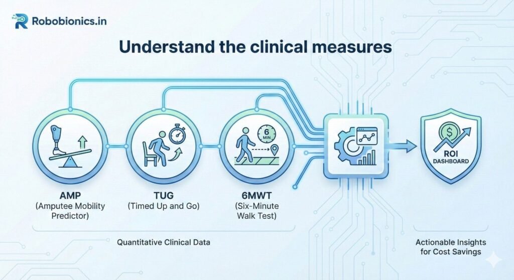
AMP is the Amputee Mobility Predictor.
It scores how a person with limb loss moves and balances.
Higher scores mean stronger function and safer mobility.
Use AMP at key points in the stay.
On admission, mid-therapy, and at discharge.
Track the change, not just the one-time number.
TUG is the Timed Up and Go test.
The patient stands, walks three meters, turns, and sits.
The time in seconds is the score.
Shorter time is better.
A small drop can be a big win.
It can signal lower fall risk and faster transfers.
The 6-Minute Walk Test measures distance in six minutes.
More meters walked shows endurance and real-life function.
It also relates to discharge plans and therapy dose.
Use a standard path and stopwatch.
Log distance, device used, and rests.
Stay strict so your numbers stay clean.
Write who did the test and when.
Note aids like walkers, canes, or prostheses.
Record pain scores and vitals if relevant.
Store raw values and calculated fields.
Never overwrite the original.
You will thank yourself later when you audit.
Scores are signals.
Outcomes are events that cost money.
You need a simple, fair bridge between the two.
Pick a few events that matter.
Falls on the ward, 30-day readmits, extra bed days.
Also track discharge to home versus facility.
Fewer inpatient falls reduce harm and cost.
Better mobility can cut sit-to-stand assist time.
Shorter TUG may lower need for a sitter or extra nurse.
Higher 6MWT can support home discharge.
That can reduce step-down bed use.
It can also spare ambulance transfers and extra days.
Start with published cut-points or your own data.
Example: patients with TUG over 20 seconds have higher fall odds.
Patients with 6MWT under 200 meters may need more support.
Turn these into risk tiers.
Low, medium, and high risk linked to each score.
Then link each tier to event probabilities.
Use six to twelve months of past data.
Group by tier and compute actual event rates.
Update the tier bands if the fit is off.
Keep the math simple at first.
You can refine later with logistic models.
What matters is a fair, transparent link.
Make a short list of unit costs.
Cost per inpatient day for each ward type.
Average cost per inpatient fall with injury and without.
Add cost per readmission day.
Cost per sitter shift if used.
Include transport and imaging if common after falls.
Your dashboard should show avoided cost.
This is money not spent due to fewer events.
It is clean and easy to defend.
If you also track revenue, keep it separate.
Show extra therapy sessions only if your model needs it.
Never blur cost and revenue in one number.
Direct costs are clear line items.
Indirect costs include delays and staff time drag.
Keep them in a second line to avoid arguments.
For example, reduced lift assists free nurse time.
You can price that time based on average wage.
Label it clearly as time freed, not cash in hand.
Leaders like ranges, not a single guess.
Show low, expected, and high savings.
Set these by applying ±10–20 percent to unit costs.
Also add a band to event probabilities.
This protects decisions from small data swings.
It builds trust without heavy stats.
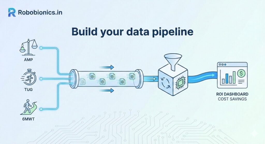
Scores live in PT notes or therapy software.
Event data lives in the EHR and incident reports.
Cost data lives in finance systems or cost accounting.
Create read-only feeds where allowed.
If not, export CSVs on a set schedule.
Keep one secure folder for all drops.
Write each field name and meaning.
Example: tug_seconds, 6mwt_meters, amp_score.
Include units, allowed values, and null rules.
Note where each field comes from.
Name the owner in case things break.
This simple page saves hours later.
Use Google Sheets or Excel first.
Make tabs for raw, cleaned, and output.
Protect the raw tab from edits.
Spreadsheets help you design the logic.
You can move to BI tools later.
First prove the math, then scale.
Use a unique patient ID that complies with policy.
Use visit IDs for readmissions and events.
Time stamps must be in one time zone.
Follow consent and privacy law.
De-identify data where you can.
Share only the minimum needed for the dashboard.
Create three views from the same data.
Executive view for outcomes and money saved.
Manager view for units, staff, and pathways.
Clinician view for patient-level progress.
Keep the style the same but the detail changes.
Each view answers a different daily question.
Show AMP, TUG, and 6MWT improvements.
Show falls avoided, readmits avoided, and bed days saved.
Then show the cost avoided for each.
Add therapy minutes and discharge destination.
These help explain why the numbers moved.
Keep all metrics traceable back to source fields.
Use line charts for trends over time.
Use bar charts for units or pathways.
Use large number cards for total savings.
Avoid clutter and color noise.
Use one accent color for positive change.
Use a calm neutral for baseline.
Not everyone needs patient-level data.
Executives see totals and rates.
Clinicians see names only when allowed.
Use your IT’s identity system.
Turn off export where not needed.
Review access quarterly with compliance.
Create tabs for Patients, Tests, Events, Costs, and Output.
Patients has IDs, age, sex, unit, and admit dates.
Tests has AMP, TUG, and 6MWT with dates and testers.
Events has falls, readmits, and discharge type.
Costs has unit cost table with dates and owners.
Output holds dashboard-ready fields.
For each patient, compute baseline and latest score.
Compute the change and map to risk tiers.
From tiers, assign event probabilities.
Multiply probabilities by unit costs.
This gives expected cost per patient.
Compare to baseline to get avoided cost.
Create tier with simple IF rules.
Example: IF(tug_seconds>20,”High”,”Low”).
Use VLOOKUP or INDEX/MATCH for cost pulls.
Expected falls avoided equals baseline risk minus current risk.
Multiply by cost per fall.
Repeat for bed days and readmits.
Add a tab for data audits.
Flag missing values and out-of-range scores.
List duplicates by patient and test date.
Track the number of tests per week.
Sudden drops signal data feed issues.
Fix upstream, not in the output.
Create tables for Patients, Tests, Events, and Costs.
Relate by patient and visit IDs.
Use a Calendar table for clean time filters.
Keep a Measures table for DAX or calculated fields.
Name measures in plain words.
Document each with a short note.
Write a measure for current TUG tier.
Write one for expected events at baseline.
Write one for expected events now.
Savings equals baseline expected cost minus current expected cost.
Add measures for low and high bands.
Use slicers for unit, pathway, and date.
Give executives a Year and Quarter filter.
Give managers Unit and Therapist filters.
Give clinicians Patient and Pathway drill.
Set default filters to this month to date.
Let users save personal views.
Keep it fast with aggregated tables.
Set refresh to match source updates.
Use incremental refresh if data is large.
Alert owners when refresh fails.
Archive snapshots monthly.
This protects your baseline.
It also helps in audits and grants.
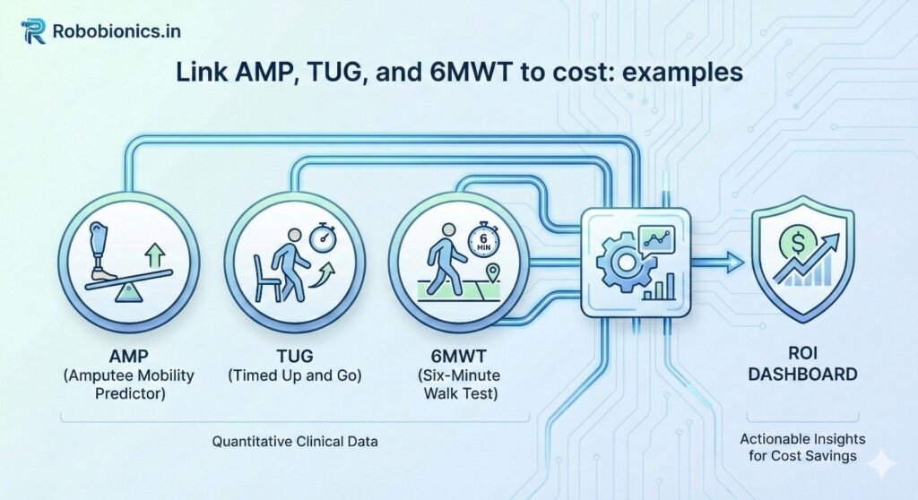
AMP rises with safe device use and balance.
As AMP improves, sit-to-stand assist often drops.
This reduces staff lift time and potential injury.
TUG time falls as gait training works.
Fewer high-risk transfers can cut sitter time.
6MWT gains support home discharge, saving bed days.
Map each change to a unit cost.
Minutes of staff time, sitter hours, and bed-day rates.
Show savings by week and by device cohort.
Early TUG below a set threshold links to safe discharge.
This can shorten step-down stays.
6MWT shows endurance for stairs and home safety.
If TUG stays high, flag extra fall risk.
Extra therapy may prevent a readmit.
Avoided readmit days drive large savings.
AMP may not apply here, and that is fine.
Use only the tests that fit the pathway.
Keep the model honest to the care plan.
TUG trends reflect balance recovery.
Tie high TUG to closer supervision costs.
As TUG drops, reduce supervision hours.
6MWT tracks endurance after stroke.
Higher distance can shift discharge to home.
Each home discharge saves facility fees.
Keep event notes tight.
Record aids, fatigue, and rest breaks.
These details explain variance to leaders.
Pick a stable period before the program.
Six months is common, twelve is better.
Exclude major policy shocks.
Compute event rates and costs for that time.
These are your baseline probabilities and unit costs.
Lock them in a read-only file.
Compare units that adopt early with those that adopt later.
Match by patient mix and severity.
This strengthens your savings story.
If controls are not possible, use rolling baselines.
Show improvement versus your own past.
Be open about limits in the notes.
Targets should be specific and dated.
Example: reduce TUG over 20 seconds by 25 percent in six months.
Tie each target to a cost line.
Review targets monthly.
Adjust when staffing or case mix changes.
Keep the goals ambitious but reachable.
Show rate of change in each score.
Small steady gains beat spikes that fade.
Plot slope, not only the endpoint.
Add notes for key changes in care.
New protocol, new device, new training.
Context turns lines into lessons.
Explain why the dashboard exists.
It is to support care, not to police.
It helps teams get resources they need.
Share early wins in simple stories.
One patient, one change, one safer day.
Stories make the numbers real.
Write a one-page guide for tests.
Same chair height, same course, same timing.
Make it part of daily routine.
Do spot checks kindly and often.
Thank people for clean data.
Fix process, not blame people.
Hold a short weekly huddle per unit.
Look at three tiles: scores, events, savings.
Pick one action, assign a name, set a date.
Next week, check the action.
If it worked, standardize it.
If not, try a new small step.
Create a small steering group.
Include clinical, finance, IT, and quality.
Meet monthly to remove roadblocks.
Publish changes to the model.
Version logs keep everyone aligned.
Transparency is your best defense.
Follow national data rules and hospital policy.
Protect identifiers and keep access tight.
Use encryption for files at rest and in transit.
Work with legal and compliance early.
Document purposes and retention periods.
Do not collect what you do not need.
Use de-identified data where possible.
Mask names in executive views.
Limit patient-level fields to the care team.
Purge exports on a set schedule.
Archive only what policy allows.
Keep a trail of who accessed what.
Explain to patients how scores help their care.
Use plain words and offer opt-outs where allowed.
Do not let the dashboard drive unsafe shortcuts.
Use the data to support therapy time, not cut it.
Savings should come from safer, faster recovery.
Patients come first, always.
If you share results outside, remove identifiers.
Aggregate by month or quarter.
Let the science shine without risking privacy.
When you publish, include limits.
Invite peers to test the model.
Better models help all patients.
Pick a standard day and time.
Open the dashboard on a shared screen.
Review scores, events, and one action.
Keep it to fifteen minutes.
End with thanks and a clear next step.
Consistency builds culture.
Invite unit heads and finance.
Show trend lines and savings ranges.
Highlight one patient story per unit.
Ask for help where you are stuck.
Maybe you need more walkers or training.
Make the ask with data and heart.
Praise teams that improve safety and speed.
Share their playbook in simple steps.
Let peers borrow what works.
Small awards can go a long way.
Badges, shout-outs, and coffee help morale.
Joy fuels better care.
Recheck unit costs each quarter.
Update risk tiers as data grows.
Add new measures only when they add value.
Retire charts no one uses.
Fewer tiles, stronger focus.
Clarity beats volume every time.

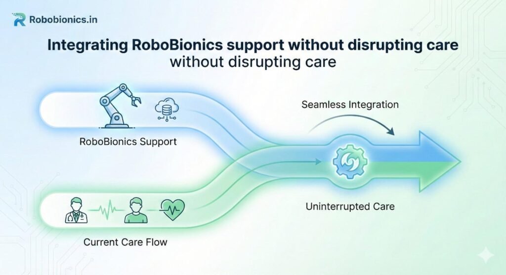
We design devices that make data easy.
Our tools support clean capture of mobility signals.
They fit your therapy flow without extra clicks.
We train staff on AMP, TUG, and 6MWT basics.
We help set up standard work and simple logs.
This makes your dashboard strong from day one.
We guide the pipeline from sheet to BI.
We help define risk tiers and unit costs.
We co-create views for execs and clinicians.
Our goal is a dashboard you own.
We build, teach, and hand over.
Your team stays in control.
Hospitals have used mobility gains to cut bed days.
They have lowered falls and sitter hours.
They have shown savings that protect therapy time.
These wins are not magic.
They are the result of clean data and steady work.
Your hospital can do the same.
If you want a working prototype fast, we can help.
We will map tests to costs with your numbers.
We will leave you with a clear, living tool.
You can book a quick demo any time.
We will listen first and build what fits.
Together, we can make care safer and smarter.
Start by setting clear bands for each test that reflect real differences in risk within your own patients rather than borrowed cutoffs that may not fit your ward mix. For TUG, you might begin with three groups such as under 12 seconds, 12 to 20 seconds, and over 20 seconds, then review six months of outcomes to see where falls and assist levels change most sharply. For the 6-Minute Walk Test, consider bands such as over 350 meters, 200 to 350 meters, and under 200 meters, and again compare each band to discharge destination, sitter use, and readmissions to confirm that the tiers are meaningful.
AMP tiers should align with prosthetic readiness and safe household mobility since these are the decisions that move cost lines. Create a low, medium, and high tier using your therapists’ clinical judgment to mark functional shifts such as needing two-person assists versus independent transfers. Keep the initial scheme simple so that staff can learn it fast, then refine after a few cycles as more local data arrives.
Once you have draft thresholds, freeze them for a trial period and avoid midstream changes that make trends hard to trust. Post the tier rules on a one-page guide near therapy stations, include a few clear examples, and add a short note on how aids like canes or prostheses should be recorded so that scoring remains consistent across shifts and sites.
After assigning tiers, compute event rates for each group using your historical records so you can see the actual gap between them. If TUG over 20 seconds shows twice the fall rate of the middle tier, that gap is the heart of your cost model, and it should appear as a simple table that any clinician can read. Do the same for 6MWT and AMP, and look for patterns that repeat month after month, which is a sign that your tiers are stable and fair.
If some tiers have too few cases to be reliable, combine adjacent groups rather than forcing precision that the data does not support. On the other hand, if a tier contains many patients with very different outcomes, split it where the curve bends, and document why you chose that split so future teams can audit your decision. The goal is a set of bands that predict events well enough to support actions without turning the dashboard into a black box.
To avoid overfitting, hold out one recent month that you do not use for calibration, then test your tiers against that month to see if the predictions stay close. If they do, lock the thresholds and move on to cost mapping; if not, adjust once, note the change, and retest so that everyone can see a clean trail from score to tier to expected outcomes.
Real-world data will have gaps, so decide in advance how to treat missing tests and odd values before they show up in your charts. If a TUG is missing on discharge, you can carry forward the latest valid score if it is less than seven days old, or else flag the case as unknown so it does not distort averages. For 6MWT distances that are clearly impossible due to typos, set a reasonable cap and prompt a review instead of deleting the row.
When a patient uses a different device or has a change in condition that makes scores hard to compare, record the context in a simple notes field and classify that test as a new baseline if the care team agrees. By writing these rules down and using them the same way every time, you protect the credibility of the dashboard and reduce time spent arguing about edge cases during monthly reviews.
Finally, publish a small set of automated checks that run with every refresh and report the count of missing values, outliers, and duplicate entries. Share that report with unit leads each week so issues can be fixed upstream, because correcting problems at the source is always faster than patching them in the dashboard layer.
Imagine your baseline suggests that patients in the highest TUG tier stay an average of 1.2 more days than the middle tier on the step-down unit. If your unit cost per day is ₹12,000, the expected extra spend is ₹14,400 per high-tier patient compared to the middle tier. When therapy helps a patient move from high to middle by discharge, you can safely claim an avoided cost of ₹14,400 for that case, and show it as part of a rolling total for the month.
To keep estimates honest, add a low and high range around your day rate to reflect shifts in staffing or case mix. If the low rate is ₹10,500 and the high is ₹13,500, the same shift in tier yields a savings band of ₹12,600 to ₹16,200. Presenting a band prevents overconfidence, helps finance plan conservatively, and still gives leaders a clear sense of scale.
Over time, replace generic unit rates with patient-specific or DRG-specific day costs if your finance system can provide them. Even a simple split between surgical and medical day rates can sharpen your model without adding much complexity, and it keeps the conversation grounded in your hospital’s real spending patterns.
In many hospitals, a fall without injury consumes staff time, imaging, and observation that together cost a meaningful amount, while a fall with injury triggers far higher costs. If your incident logs and finance records show an average of ₹18,000 for a non-injury fall and ₹95,000 for an injury fall, and your historical mix is four non-injury events for every injury event, your blended cost is ₹33,800 per fall. That blended figure is what you multiply by the change in expected fall count as patients move between TUG tiers or as AMP rises during prosthetic training.
If the dashboard shows that your new pathway has reduced expected falls by 0.06 per patient over a month across 120 discharges, that equals 7.2 avoided falls, which at ₹33,800 per fall becomes about ₹2.43 lakh in avoided cost for that month. Display it next to the contributing clinical shift so the team sees the direct link between better mobility and safer wards, and always label it as avoided cost rather than cash in hand to maintain clarity with finance.
For completeness, track downstream effects such as sitter hours that often decline as fall risk drops. Price sitter time with a simple hourly cost, show the hours reduced, and present it as a separate line under indirect savings so that decision makers can acknowledge the benefit without confusing it with hard spending cuts.
Readmissions usually carry the largest single-ticket cost impact, but they are rare events, so your estimates must be careful and conservative. Use your own 30-day readmission rate by tier to set the baseline risk, and apply the average length of stay and day rate for readmitted cases to estimate the cost per readmission. If a readmission averages three days at ₹14,000 per day, the gross cost is ₹42,000, to which you may add typical lab and imaging costs if finance agrees.
Suppose patients with a low 6MWT at discharge have a 12 percent readmission rate, while those above your endurance threshold have a 7 percent rate. Moving one hundred discharges from low to high endurance would then be expected to prevent five readmissions, worth about ₹2.1 lakh in avoided costs. Display the number of patients shifted, the expected readmissions avoided, and the savings range with a small confidence note that reminds leaders this line carries more uncertainty than bed-day math.
To avoid claims that cannot be defended, create a simple rule that you only attribute avoided readmissions to the dashboard program when there is a documented change in therapy dose, device use, patient education, or follow-up that was triggered by the dashboard insight. This keeps the story clean and encourages teams to use the data to act, not just to report.
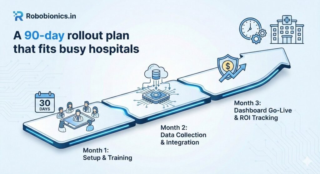
Begin with a short kickoff where clinical leads, finance partners, and IT agree on a single purpose statement, the three tests to track, and the cost lines to convert. In the same week, write a one-page data dictionary and a simple scoring guide, then collect three to six months of historical scores and events so you can calibrate tiers and check the strength of the links to outcomes. Build a spreadsheet prototype that calculates tiers, assigns probabilities, multiplies by unit costs, and presents totals along with a notes field that explains each step in plain language.
Pilot the prototype with one unit and five to ten patients for two weeks, and hold quick feedback sessions every few days to surface issues in scoring, timing, or data entry that will otherwise break trust later. During this period, ask finance to validate each unit cost and sign off on the ranges so you do not need to revisit them in every meeting, and lock a baseline period that everyone agrees reflects normal operations rather than a surge or staffing shortage.
By the end of day thirty, you should have a working prototype that loads a fresh CSV, updates savings numbers, and produces a small set of charts that leaders can scan in under two minutes. Keep the scope tight so that teams build confidence in the flow from test to tier to cost, because that confidence will carry you through the next stage when more users and more data come online.
Move the logic from the prototype into your chosen BI tool or a protected spreadsheet that refreshes on a schedule, and design three role-based views with shared colors and simple language so users feel at home no matter which view they open. Create a weekly cadence of five-minute huddles on the pilot unit where the lead therapist opens the dashboard, names one positive shift, and selects one action for the next week, then record the action in the dashboard notes so the loop is visible.
During this window, run short hands-on training for therapists on consistent test methods, for managers on reading tiers and ranges, and for finance on how the savings math is built from unit costs they approved. Identify two to four champions who can answer questions on the floor, and give them a direct line to the dashboard team so small problems get fixed before they spread into myths that the system is wrong.
By day sixty, the dashboard should refresh automatically with at least weekly data, flags should identify missing or suspect values, and the pilot unit should be using the tool in routine huddles. Capture one or two short success stories where a visible change in a test score led to a different discharge plan or a safer transfer, because those stories will help the next units accept the new way of working.
Add one or two more units with similar patient profiles so you can reuse most of the same tier thresholds and cost lines, and hold a brief kickoff in each unit to set expectations and explain the feedback loop. Strengthen your data pipeline by moving manual exports to scheduled drops or secure feeds, and add automated alerts for failed refreshes so the dashboard team hears about problems before users do.
At the same time, finalize a simple governance rhythm that includes a monthly steering meeting, a version log for any model change, and a quarterly review of unit costs against finance records. Document the onboarding steps for new users, including a quick video walkthrough and a one-page quick start that explains what each tile means and when to raise a ticket.
By day ninety, the dashboard should be part of routine management for at least two units, the math should be stable, and leaders should see a clear link between better test scores and avoided costs. At that point you can decide whether to expand to more units, add patient-reported outcomes, or integrate device data, but only after confirming that the current scope is reliable and well used.
Agree on the exact way to perform TUG, AMP, and the 6MWT, including the chair height, walking path, timing method, and allowed aids, and put those rules on a visible card in every therapy area. Record the device used, the tester’s initials, and any unusual conditions such as fatigue or pain spikes, because these notes will save time when managers review trends and ask why a week looked different.
Set a fixed schedule for when tests are done in the patient journey, such as at admission, mid-stay, and discharge, and build reminders into the ward routine so scores are not missed. When workflows are predictable and documented, data becomes steadier, and the link to costs grows more credible in the eyes of finance and leadership.
Finally, create a simple naming and dating rule for files and forms so that anyone can find the latest scores quickly. Small acts of standardization reduce friction, protect trust, and keep attention on patients instead of chasing paperwork.
Turn on basic validation like allowed ranges for times and distances, and use drop-downs for common fields to avoid typos, which is a low-effort way to prevent most errors. When a value falls outside the normal range, prompt the user to confirm or correct it before saving, and log the event so the dashboard team can track patterns that may signal training gaps.
Run a short daily check that lists missing discharge tests, duplicate entries, and mismatched dates, and assign a single person per unit to resolve these items before the next refresh. The faster you catch small issues, the less time you spend later explaining why charts do not match what staff remember from the floor.
Share a weekly quality score with each unit that shows the percentage of complete records and the number of corrections needed, and thank teams that maintain high quality. Positive feedback encourages steady habits and keeps the culture supportive rather than punitive.
Hold friendly micro-coaching sessions where a lead therapist watches a colleague run a test and offers one or two tips on timing or documentation, which makes standards real and respectful. Rotate this role so skills spread across the team and no one feels singled out, and collect common questions to update the one-page guide so the answers live where people need them.
Invite finance and quality leaders to attend a few huddles so they can see how clean data serves both patient care and cost stewardship, which helps remove the sense that data entry is a chore done for someone else. When people see their work shaping safer discharges and fewer risky transfers, they engage more fully and the numbers stay strong.
Close the loop by showing how a recent improvement in test capture led to clearer savings estimates or faster decisions on equipment purchases. Linking good data to real-world wins builds pride and makes the dashboard part of the unit’s identity rather than an external demand.
Design the senior view to answer what changed, why it changed, and what to do next, using a small set of tiles that load fast and tell a simple story. Place total avoided cost for the quarter at the top with a clear range, followed by trend lines for TUG, AMP, and 6MWT changes, then show the breakdown by unit so leaders can spot where help or praise is needed. Add a short annotation panel where unit leads can tag protocol changes, staffing shifts, or equipment additions, because context turns numbers into decisions.
Keep navigation friction-free with a single date selector and two or three filters such as unit and pathway, and remember that most executives will open this on a phone, so fonts should be large and legends minimal. Include a compact methods link that explains, in plain language, how the savings are calculated, because transparency prevents side conversations and builds durable trust.
At the bottom, place a gentle call to action that names the next review and the owner of any cross-unit item, which gives momentum without adding to email traffic. The wallboard should feel calm and factual, helping leaders see progress at a glance and support teams without diving into detail unless they choose to.
For managers, present score distributions, risk tiers, and event counts side by side, so they can relate therapy progress to real-world safety and flow. Show how many patients moved from high to medium risk in the past week, how that shift changed expected bed days and falls, and which steps in the pathway contributed most, such as earlier gait training or better device fitting.
Include a small list of patients who are close to crossing a threshold, because timely attention can move them safely to a lower risk tier before discharge. Provide a notes field next to each suggested action so managers can record what they will try this week and what help they need, and surface those notes in the executive wallboard to keep everyone aligned without extra reports.
Offer a print-friendly snapshot for the weekly huddle that fits on one page, which many teams still value for quick stand-ups. The snapshot should use the same colors and labels as the live view so talking points match the screen and reduce confusion during busy shifts.
Clinicians need a clean, patient-level view that loads instantly and shows the latest AMP, TUG, and 6MWT values, the current tier, and the next test due, along with any alerts tied to safety or discharge planning. Include a short history chart so therapists can show patients and families how far they have come, which boosts motivation and helps with shared decisions about home versus facility discharge.
Make it easy to add a brief note such as a change in assist level or new device use, and ensure those notes feed back into the manager and executive views so the story remains consistent across levels. When a clinician updates a score, reflect the change in the expected events and savings fields in real time, which creates a strong sense of agency and shows that better mobility today matters to both safety and costs.
Avoid clutter, remove anything that does not guide the next action, and present one subtle link to the test protocol so new staff can check details without leaving the patient. A view that respects clinical time earns trust and becomes a natural part of daily care rather than an extra task.
Our bionic hand and rehab tools are designed to capture clean, practical signals that map well to AMP changes, such as grip patterns, assist levels, and training milestones. When AMP rises and transfer safety improves, units often need fewer high-risk lifts and spotters, which can free short blocks of staff time across a shift, and the dashboard can count those blocks in a cautious way that finance will accept.
We work with your therapy team to set simple recording habits that align with your current notes, so nothing extra is added to the day, and we help translate those small functional gains into expected reductions in sitter hours or lift assists. This linkage makes staffing conversations easier because it connects patient safety, clinical progress, and resource use on one screen that everyone understands.
By focusing on the change in function that is already measured rather than adding new forms, we keep the workflow light and the data credible, and your teams see the benefit of technology in the same place they see patient gains.
During setup, we run short, hands-on sessions that show exactly how to perform and record tests so that results remain steady across people and days, which is the base for any reliable cost model. We support unit leads as they practice weekly huddles with the new dashboard, helping them turn charts into one small action per week and then capture the outcome so improvement loops are visible and quick.
Our approach treats the dashboard as a tool that serves caregivers rather than a scorecard that judges them, and we keep the tone humane by pairing every chart with a patient story where better mobility led to a safer discharge. This kind of rollout reduces resistance, keeps focus on recovery, and gives leaders the confidence to back the program with real resources.
When issues arise, we fix them with the people closest to the work, adjust rules in the open, and log every change so future teams understand what shifted and why. That transparency keeps trust high and helps the dashboard become part of how the hospital learns, not a passing project.
We aim to leave you with a dashboard that your teams own, your finance partners trust, and your clinicians find useful in daily care. Our role is to help you build the bridge from AMP, TUG, and 6MWT to avoided cost, to teach your staff the routines that keep data clean, and to stand by you as the first units adopt and refine the approach.
If you want to see a quick prototype built with your own sample numbers, we can set up a short session, map your tests to your cost lines, and show a live view that leaders can try immediately. When you are ready, you can schedule a demo, share your goals, and we will help you craft a plan that fits your wards and your patients while keeping the focus on safety, dignity, and value for every day of care.
For many clinicians, the surgery is only the first step. What happens after the operation

For trauma amputees, the journey does not begin at the prosthetic clinic. It begins much

Amputation after cancer is not just a surgical event. It is the end of one

When a child loses a limb, the challenge is never only physical. A child’s body